Corporate Mark Standard
The Corporate Mark symbolizes DFLUX's forward-looking vision of infusing new energy into business and everyday life by combining the importance of design with digital technology to offer a brighter future. The name 'DFLUX' blends 'design,' 'flux,' and 'lux,' representing our commitment to continuous innovation and creative solutions that illuminate both business and daily life.
Color Palette
Dedicated Color System
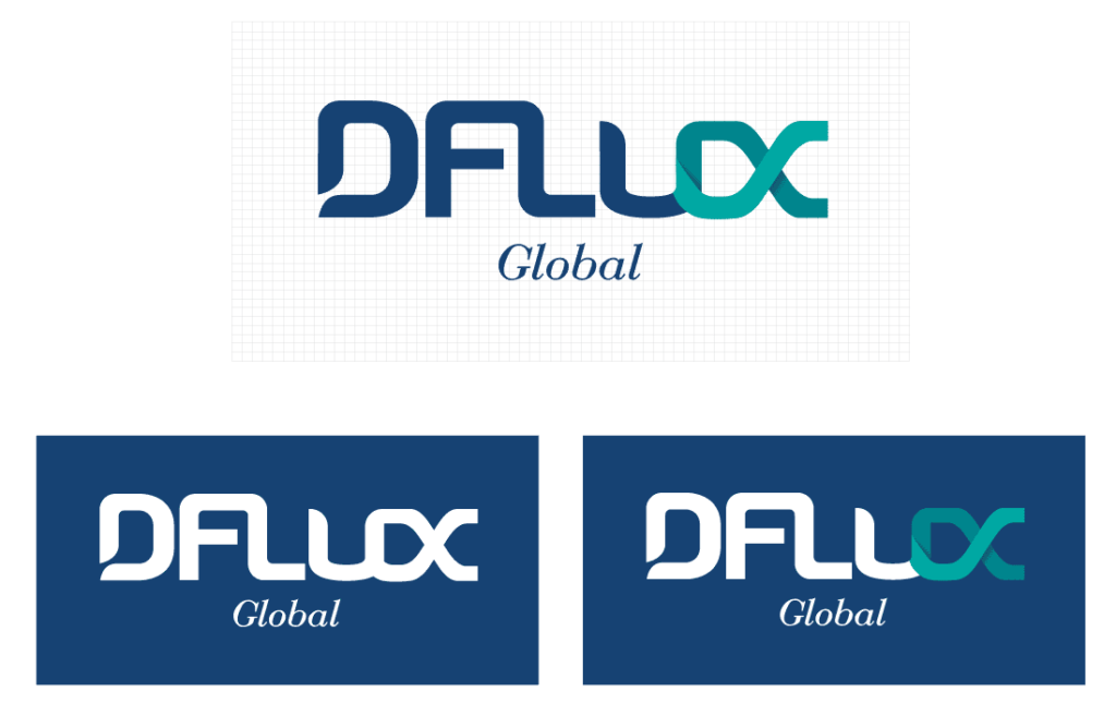
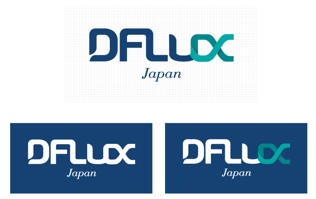
The navy and mint colors each carry unique meanings and characteristics, and by using these two colors, DFLUX can effectively highlight its brand identity and vision.
Navy Blue: Symbolizes trust and professionalism.
Mint Color: Represents creativity.
The combination of these two colors perfectly harmonizes the dual characteristics that DFLUX strives for: stability and innovation, professionalism and creativity. This blend symbolizes our commitment to bringing bright and positive changes to business and daily life through the fusion of digital technology and design. Deep blue conveys depth and trust, while mint color embodies vibrancy and creative energy. Together, these colors reflect DFLUX's forward-looking vision.

